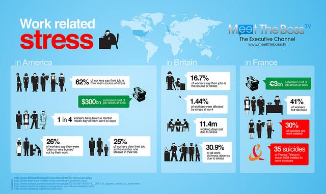
Pretty much everybody has seen infographics on social media sites or on a company’s website before. However, in the past, it was pretty much only large companies with considerable resources and time to collect data that were using and implement infographics effectively.
Today, even small businesses can create infographics, and they can be a huge boon to you overall social media presence. Infographics can help you create a viral marketing campaign and really get your content out there to users who will share it – something that’s very important for reaching new customers and your general target audience.

An example of a well laid out infographic / Image Courtesy of Flickr
Accuracy First
More important than anything else when it comes to creating effective infographics is accuracy. If you the infographics you create aren’t accurate, your users will figure this out, and pretty much anything you present from that point on will be taken with a grain of salt.
Startling facts and interesting numbers make for great infographics, but don’t stretch the truth to fit your marketing campaign. If you’re not sure about your information you need to take time and do the proper research before you post to keep from looking silly in the long run.
If you can’t verify a piece of information in an already created infographic make sure you remove the questionable information before you post.
Use Complementary Colors
You might not think that the colors you use in your infographics are all that important, but the truth is that color sends signals and certain ideas to people viewing your content. In fact, there’s a whole theory behind which colors you should use for certain types of information and businesses.
While the particular colors you use may not be of the utmost importance, using complementary colors is. They make your infographics visually appealing, and that means that people are more likely to stop and pay attention to the information they contain and then share that information with others.
Make Your Font Bigger
One of the most common mistakes people make when they first begin creating infographics is that they make the font too small. In many cases, people do this to try to fit more information into a small infographic.
Small fonts and lots of information look intimidating to many readers, and they don’t have the time to invest in an infographic they think it will take 10 minutes to understand. Fonts that are too small also make important facts seem less important – even if that’s pretty much on a subconscious level.
It’s also important that you use a font that’s easily recognizable yet stylish. Many people choose basic fonts like Arial because they’re easy to read but aren’t the more typical Times New Roman.
The font you choose for your infographic is up to you, but make sure it’s easy to read at first glance.

Font size, color and text all play an important role in creating an effective infographic / Image Courtesy of Flickr
Creating infographics for social media is a great way to create backlinks, which can help increase your Google search results, and they can also help expose new reader’s and users to your company’s brand identification or logo – even if they don’t fully read your infographic.
As with any social post, make sure you post when readers will find your content. You’ll get most of your views within the first few hours, so that’s particularly important for reaching your customers and potential new customers with infographics.
If they don’t see them, they can’t spread them, and that means no viral marketing.
About the Author:
Marcela De Vivo is a freelance writer and online marketing professional in Southern California. Writing for HostPapa has given her the opportunity to share her knowledge of content development, social media marketing, web analytics and so much more! Having created many infographics herself, she knows how big a difference they can make for a marketing campaign.